Google Just Gave Its Icon a Quiet Glow-Up After 10 Years
Share
After nearly 10 years, Google has quietly rolled out a refresh of its iconic ‘G’ icon. While the update may appear subtle at first glance, it’s already making waves in the design world.
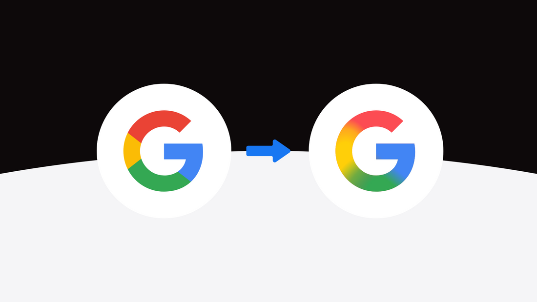
On May 12, 2025, users began noticing a visual change in the Google Search app icon across iOS and Android. The four-colour “G” that defined Google’s branding since its 2015 rebrand has been replaced with a smoother, more vibrant gradient version. The red now blends into yellow, yellow into green, and green into blue.
It’s a soft update, but one that feels deliberate and forward-looking. This design shift says a lot about where Google is headed visually, and perhaps where the rest of the industry is going too.
What’s Changed?
Back in 2015, Google introduced a new look with Product Sans, along with the now-familiar circular "G" made up of four flat, geometric colour segments. It was a bold move at the time, aligning with the popularity of flat design and minimalism.
Now, the sharp transitions between the colours have been replaced with a fluid gradient. The updated icon is more expressive, more visually cohesive, and adds a sense of motion. It’s a small but noticeable departure from the rigid geometry that defined the past decade.
The new icon has already rolled out on the Google Search app for both iOS and Android, with more updates expected across platforms.
A Visual Direction Aligned with AI
This gradient update isn’t just about aesthetics. It mirrors a broader shift in Google’s design language, especially in the context of AI. The gradient feels familiar to the styling seen in Google’s Gemini branding and even in the “AI Mode” shortcuts in Google Search, which also favour softer, more dynamic visuals.
This update may be the beginning of a more cohesive visual system across Google’s ecosystem. With other four-colour products like Chrome, Maps, Gmail, and Calendar using similar palettes, it wouldn’t be surprising to see them adopt this new gradient approach over time.
The timing also aligns with a quiet design trend among other major tech brands. Both Amazon and Adobe have recently introduced subtle logo refreshes, signaling a broader move away from flat design toward something more expressive and dimensional.
Why It Matters
Any time Google changes its visual identity, even slightly, it matters. The ‘G’ icon is one of the most recognizable symbols on the internet. It lives on billions of devices, appearing in search results, browser tabs, mobile apps, and more. A shift like this is never random.
This new icon reflects a design philosophy that favours flexibility, depth, and a more organic feel. Gradients allow for smoother transitions across dark and light mode, better responsiveness in motion design, and a more human tone that feels right for today’s evolving digital interfaces.
For a brand like Google, this update also sets a tone. It shows a willingness to evolve, to experiment subtly, and to embrace a more emotionally resonant visual language.
What People Are Saying
Initial reactions to the updated logo have been largely positive. Many have praised the gradient as feeling more modern and visually pleasing. Some have commented that the older version already looks outdated by comparison, even though the core shape has remained the same. Of course, a few light-hearted takes have compared the new design to a blurry version of the old one, but overall, the reception has been enthusiastic and supportive of the change.
Our Take as Designers
This is a great example of a brand evolving without losing its identity. Google didn’t overhaul the logo, they refined it. And that’s often the smarter move.
The new gradient introduces motion and depth, making the icon feel more adaptable across screen sizes and digital contexts. It’s also more in tune with AI-powered design systems that favour responsiveness, personalization, and warmth.
In a digital-first world, your brand has to do more than just look good. It has to feel right, stay relevant, and adapt with the platforms people use every day. Google’s update is a masterclass in that approach.
Thinking About a Refresh?
If your brand visuals haven’t been touched in years, this might be a good moment to ask: is your identity still serving you in today’s fast-moving digital landscape?
When you’re ready to explore a modern, forward-thinking refresh, we’re here to help.
Let’s talk.